The Text Effect panel
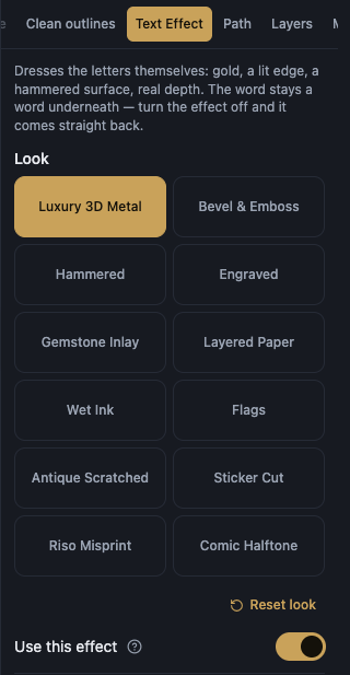
Text Effect dresses the letters themselves: gold, a lit edge, a hammered surface, real depth. The word stays a word underneath, and turning the effect off brings it straight back. The panel only shows the groups the chosen look actually reads, so a look with no depth has no Depth group at all.
The look and the switch
Look is a gallery of fourteen: Luxury 3D Metal, Bevel & Emboss, Hammered, Engraved, Gemstone Inlay, Layered Paper, Wet Ink, Flags, Antique Scratched, Sticker Cut, Riso Misprint, Comic Halftone, Chiselled Gold, and Polished Chrome.
Use this effect paints the selected word with the chosen look. Turning it off restores the plain word exactly.
Reset look puts every value of this look back to where it started, and stays quiet and off while nothing has been changed.
Pictures cannot take an effect, because a picture is an image with no outline to light or extrude, and the panel says so when the selection is one.
Material
Material offers nineteen: Gold, Rose gold, Platinum, Silver, Steel, Bronze, Copper, Pearl, Ivory, Emerald, Jade, Turquoise, Sapphire, Amethyst, Ruby, Blush, Obsidian, Your own colour, and the flag colours.
Every look starts on Gold except Polished Chrome, which starts on Steel, since a chrome mirror in gold is not the point of the look. Press any other swatch at any time to leave that starting material behind.
Brightness lightens the material, from deep and rich to pale and bright.
Front colour is the colour of the letters' front face. Choosing one here replaces the material with your own colour, and picking a material again brings it back.
Surface shadow, Surface light, and Surface peak set the darkest tone of the surface, its lit tone, and its brightest point. Leave any of them unset and it is derived from the main colour.
Reset material puts the material and its colours back.
The Flags look paints a list of colours rather than one material, and the Riso Misprint look names every colour it paints with its own control, so neither offers this section.
The flag colours
With the Flags look, a Colours section takes the place of Material. It opens with Surface, which has three settings: Pumped out, Flat, and Cut in.
Band sets one of the word's bands, and Add a band and Remove a band change how many there are.
Band sizes is a bar whose dividers you drag to give one band more room and its neighbour less, and Even sizes puts them all back to equal shares.
Band direction decides which way they run: 0 lays them across the letters and 90 runs them down.
Depth colour is the colour of the sides receding behind the letters, and Back to the flag's colours restores the whole set.
Depth
Depth is how far the letters stand up off the page. At zero they lie flat.
Space between layers, in the Layered Paper look, is how far one sheet sits from the next. It is not the depth: depth is how far the whole stack goes, this is the gap between one sheet and another.
Depth direction decides which side of each letter shows, and Taper narrows the far end of the depth so the sides lean the way a real block does.
Depth density is how far the sides fade into darkness, Depth opacity is how solid they are, Depth softness is how blurred they are, and Depth grain is how rough they are.
Depth light direction, Depth light position, and Depth light strength control the light falling on the receding sides, which is separate from the light on the face.
Depth finish decides what those sides are made of: Matte is a plain fade, Plastic adds one soft sheen, Metal bands the light, and Shine puts a bright streak just under the face.
Side colour, Depth far colour, and Depth light colour name the three colours of the depth. Leave the far one unset and it is derived by darkening the nearer one.
Surface and Light
Pumped out is how far the letters are pushed out of the page. On the Engraved look it is how deep the cut goes instead.
Edge rounds the front edge of every letter and catches the light on it.
Hammering beats the surface like hammered metal, and at zero it is smooth. Hammer size sets how big each dent is, a few large ones or many small ones.
Grain adds fine texture to the metal. A little reads as real; a lot reads as old.
Shine is how mirror-like the metal is, and how strong the bright band across it looks.
Light direction is where the light comes from, and Light height is how high it sits, from grazing along the surface to straight overhead.
On any look whose Pumped out dial is above zero, Edge highlight and Edge shadow set the colour of that raised or cut edge's bright and dark sides. Left alone they match the warm cream and dark brown that edge has always used.
Sparks and Patina (Chiselled Gold)
Sparks is how many bright glints strike the letters' lit edges. A few read as real light caught on the metal, many turn the word into jewellery.
Spark size is how big each glint is, Spark bloom is how wide the soft halo behind each one spreads, Spark opacity is how solidly the glints paint (slide it down for faint traces of light), and Spark placement slides every glint to a different spot on the same edges without changing how many there are.
Spark colour is the glints' own colour: left alone they wear the material's own tones, the same golds the letters do, and a chosen colour turns them into shades of itself. Each glint takes its own size and tilt from where it sits, so the field never looks stamped. Sparks behind letters tucks them behind the word, light leaking from its edges instead of striking its face. Twinkle makes the glints light up one after another instead of resting still; it plays on screen and in an SVG file, and a still picture holds one frame of it.
Patina is how heavily an aged stain gathers and darkens the metal where its surface dips, at zero the metal is clean and new. Patina colour is that stain's own colour, a green cast reads as old bronze, a brown one as tarnished gold.
The horizon (Polished Chrome)
Polished Chrome paints a mirror horizon instead of a textured face: a bright sky over a dark ground, with no bump, grain or shine dials of its own.
Horizon angle is which way the mirror's line runs across the letters, upright is the usual chrome and turning it tilts the whole reflection.
Horizon height is where that line sits on the letters, from high near their tops to low near their feet, and Horizon sharpness is how crisply the reflection meets it, from a soft fade to a hard mirror cut.
Shadow and Glow
Shadow strength is how dark the shadow is, and at zero there is no shadow at all.
Shadow softness is how soft its edge is. At zero it is completely solid, a hard-edged copy with no blur, which is a look in its own right.
Shadow distance is how far it sits from the letters, and Shadow direction is which way it falls. That direction is separate from the depth direction, so the letters can stand one way and be lit from another.
Shadow colour is the colour of the shadow the letters cast on the page.
Glow strength is how strong the halo around the letters is, and at zero there is none. Glow size is how far it spreads before any softening, and Glow softness is how far its edge fades away.
Glow colour is the halo's own colour. Left alone it follows the material's lit colour, so it always shows.
Motion
Moving shine sends the bright band travelling across the letters over and over. Shine speed sets how fast, and Shine width sets how wide, from a sharp glint to a wash of light over the whole word.
Shine goes back and forth sends the band back the way it came instead of starting from the same side every pass.
Moving depth light sends the light travelling around the receding sides, with Depth light speed beside it. It is separate from the shine on the face, so one can move while the other stays still.
Looks with no polished face do not offer the shine controls, because they paint no bright band at all. The stored values are kept, so picking a metal look brings them straight back.
Movement plays on screen and in an SVG file. A PNG, JPG, WebP or PDF holds one still picture, so it catches the movement wherever it happens to be.
Stars
The Flags look adds a Stars section. Three stars is its switch, and the stars are clipped to the letters, so a star only shows where a letter reaches.
Space between stars brings them together in the middle or spreads them across the word, and Star size grows or shrinks them, with the middle of the dial being the size the flag itself gives them.
Stars up and down walks them up or down the word, with the middle of the dial keeping them on the middle band. Star turn turns each one, and at zero a point faces straight up, the way the flag has it.
Star colour is their own colour. Stars in front draws them ahead of the letters, and turning it off puts them behind the word.
Keep the stars inside the letters clips every star to the letters, so a star moved off them simply disappears. Turn it off and they are free to sit above or below the word.
The cut, the printing, the dot screen, and the ink
Sticker Cut: Border distance is how far the cut border sits from the letters, which is the white edge of a printed sticker, Corner rounding is how round that cut's corners are, Lift off the page is how high the sticker sits and throws its hard shadow, and Border colour is the border's colour.
Riso Misprint: How many copies is Two or Three, Distance apart is how far the printed copies sit from each other, Slip direction is which way they slip, Overprint is how strongly the inks darken where copies cross, and Copy ink gives every copy its own colour.
Comic Halftone: Dot shape is Round, Line, or Square, then Dot size, Space between dots, and Screen direction, with Second colour slip for how far the second plate misses and Second colour for its ink.
Wet Ink: Ink creep is how far the ink runs out of the stroke along the paper fibres, Pooling at the edge is how darkly it gathers in a rim, Paper soak is how much the paper drinks it into a soft halo, and Splatter is how many stray specks the pen throws. Hammer size sits with them, for the fineness of the paper itself.
The effect on export
A PDF that has an effect on it is saved as one high-resolution picture inside the page, so it looks exactly like the screen. Its text stops being selectable vector artwork, because there is no way to draw a lit metal surface with vectors.
A PDF with no effect is unchanged: still sharp, still vector.