The Editor screen
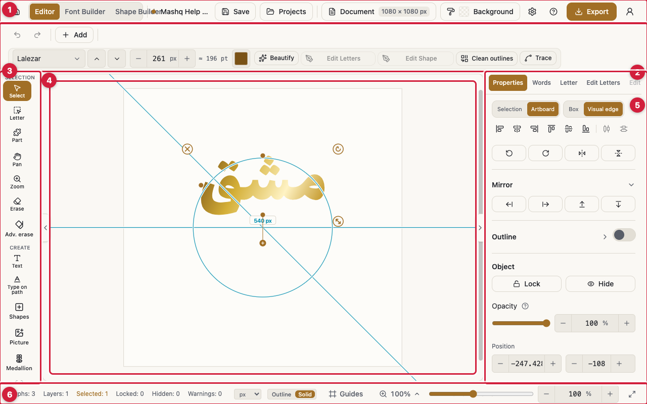
This page walks the Editor screen area by area: the app bar, the options bar, the canvas, the status bar, and what changes on a phone. Every control is named exactly as it appears on screen.
The app bar
Back to home is the house icon at the start of the bar. It takes you to the website's home page.
Next to it are the three tool links: Editor, Font Builder, and Shape Builder. The tool you are in is highlighted and not clickable. These links show on larger screens; on a phone they sit inside the project menu instead.
The project name sits beside a small coloured dot. Click the name to edit it in place. This is the same Rename project action the Projects dialog offers.
Save stores the project right away and shows a short message with the result. Its shortcut is Cmd+S or Ctrl+S. Your work also saves on its own a couple of seconds after each edit.
Projects opens the Projects dialog: new project, open, duplicate, delete, download, and the import and export rows.
Document opens the artboard settings, and Background opens the paint for the page itself. Beside them, the settings button opens the view menu.
Help opens these pages in a new tab, so the artwork you have open is never disturbed.
Export is the coloured button at the end of the bar. It opens the export menu and its formats.
The account icon opens a menu with your name and plan, Theme and Language, Keyboard shortcuts, Manage subscription for accounts with a live subscription, and Sign out.
The options bar
Undo and Redo step through the whole history, with no depth limit shown in the interface. On a phone they move up into the app bar.
The Add menu holds every way to put something new on the page: Add text, Add shape, Add picture, Import and trace, Add from template, Add font shape, Add marks, and Add guides.
Font pack is a searchable font list, with Previous font and Next font beside it so you can flip fonts and watch the canvas change. Font size sits next to it.
Color opens the paint pop-up for the current selection: one colour, solid colours, or a gradient, plus the pattern.
Beautify suggests better-connecting shapes and tidies mark spacing. It shows a preview and a quality score before you apply anything.
Edit Letters and Edit Font Shape and Outline are the two toggles that open the point-editing panels. Clean outlines opens the merge panel. Trace picture appears when the selection is a picture.
Document
Artboard carries Width, Height, and Unit. The units are px, mm, cm, and in.
The ready sizes are grouped in three. General has Custom, Square, Poster, and Banner. Print has A4 portrait and landscape, A3 portrait and landscape, Letter portrait and landscape, Business card, and Certificate. Social has Instagram square, portrait and story, Facebook post and cover, X post, YouTube thumbnail, TikTok, and WhatsApp status.
On a phone the same settings open as a bottom sheet called Document.
Background
Background paints the page itself, not what sits on it. It takes one colour, solid colours, or a gradient, exactly like any other paint.
Pattern lays a repeating motif over that paint, with Pattern size, Pattern opacity, Pattern angle, and Pattern color. The editor grid hides itself while a pattern is showing.
On a phone you reach the background from the bottom tool strip.
The view menu
The Show group switches what you see over the canvas: Grid, Rulers, Guides, Equal spacing guides, Tashkeel, Anchors, Bounds, and Ghost of original, which keeps a faint trace of the original shape while you edit points.
The Snap group has Snap to grid, Snap to guides, Lock guides, and Clear guides.
The Helpers group has Grid color, Work area color, and Reset to default.
Full screen gives the canvas the whole screen, and Exit full screen gives it back.
Ruler unit picks the unit for the rulers and the readouts: Pixels, Points, Millimetres, Centimetres, or Inches.
The status bar
At one end sit the live counters: Glyphs, Layers, Selected, Locked, Hidden, and Warnings.
View switches between Outline and Solid, which is whether letters are drawn hollow or filled on screen.
The Guides menu gathers showing, locking, and clearing guides, together with Snap for both the grid and the guides.
Zoom has a slider and a number field, plus three ready commands: Fit to screen, Fit all, and Actual size (100%). You can also zoom with Cmd or Ctrl and the plus and minus keys, or by pinching on a touch screen.
The status bar is a large-screen surface. On a phone, zoom, full screen, and the unit move to a small floating chip over the canvas.
The canvas
Pan (hold Space and drag) moves the view without changing tools. On a touch screen, one finger dragging on empty canvas does the same.
Dragging on empty canvas draws a rubber band that selects whatever it covers. With the Letter and Part tools it selects letters or parts instead.
Floating handles surround the selection: Rotate, Move, and Delete. The corner handles Resize, keeps the proportion (hold Shift to change the proportion).
On the edge of the selection box sits the handle marked Drag to wrap the text into lines. On that same edge, holding Alt while dragging stretches the text with kashidas and the letters keep their shapes.
Right-click on a desktop, or long-press on a touch screen, opens the menu for the selection. It holds Select all, Copy, Paste, Copy style, Paste style, Duplicate, Delete, Group, Ungroup, Unite into one shape, Convert to shape, Align and distribute, the layer ordering actions, Lock, Hide, Mirror horizontally and vertically, Flip horizontally and vertically, Edit letters, Edit font shape and outline, and Break apart.
Copy style / Paste style carries one object's whole look onto another (never its text, font, size, or letter edits), and pasting onto several selected objects at once applies it to all of them. Copy and Paste move whole objects through the system clipboard, so a copied object can be pasted into a different project or browser tab. On a phone the same four rows are also one tap away from the selection's ... chip.
On a phone
The app bar carries Undo, Redo, and the project menu, which holds rename, save, projects, document, and the links to the other tools.
The bottom bar has Add at one end and Properties at the other, with a tool strip between them that scrolls sideways.
The twelve sidebar panels open as one sheet called Panels, where each panel is a tab in the same order and under the same name.