The Properties panel
Properties is the panel for the whole object: where it sits, how it turns, what surrounds it, how wide it is, and whether anything in it needs your attention. This page walks its sections in the order they appear.
Font and size on a phone
On a phone the panel opens with Font pack and Font size. On larger screens the options bar above the canvas owns those two, so they are never shown twice.
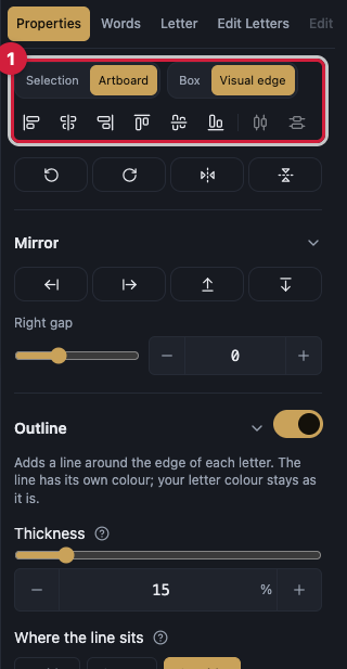
Align and distribute
Six align actions: Align left edges, Align horizontal centers, Align right edges, Align top edges, Align vertical centers, and Align bottom edges.
Distribute horizontally and Distribute vertically even out the gaps between objects.
Align to picks what you align against: Selection or Artboard. Aligning to the page needs an artboard size set first.
Align by picks what is measured: Box, the bounding rectangle, or Visual edge, which is the default and hugs rotated and curved shapes.
Aligning needs two or more objects and distributing needs three or more, and the panel says so when the selection is smaller.
Quick actions and Mirror
At the top of the panel sit the one-tap actions: Flip horizontally, Flip vertically, and Rotate.
Mirror duplicates the selection and reflects the copy in one direction: Mirror left, Mirror right, Mirror up, and Mirror down.
Each direction has its own distance: Left gap, Right gap, Up gap, and Down gap, which is how far the reflection sits from the original.
Outline
Outline the letters puts a line around the edge of every letter. The line has its own colour, the letter colour stays as it is, and turning the switch off brings the plain letters back.
Thickness is how heavy that line is. Outline colour is the line's own colour.
Where the line sits decides which side of the edge spends that thickness. Inside keeps the whole line within the letters, so they look thinner. Centre puts half in and half out. Outside leaves the letterform untouched.
A baked piece, meaning a merged, traced, or converted outline, has no letters to surround, so it is not offered this section.
Combine shapes and Break apart
Merge melts the selected shapes into one clean shape, and the lines where they overlapped are removed for real.
Cut front makes the shapes in front bite into the bottom shape and then disappear, leaving the bottom shape with the bite taken out.
Both work on shapes and outline pieces only. Convert text to outlines first. Pictures, lines, and locked layers cannot combine, and shapes that do not overlap have nothing to cut.
Break apart splits an outline layer into its separate parts, and each part keeps its own openings. It needs one unlocked outline layer with more than one piece.
Object
Position holds Position X and Position Y, Rotation holds the angle, and Scale holds Scale X and Scale Y. Between them sits Link scale (keep proportions); unlinking it gives you free proportions.
Reset transform puts position, rotation, and scale back to where they started. You can always drag the artwork on the canvas to move it.
Lock protects the layer from editing, and Hide takes it off screen without deleting it.
Opacity is how see-through the whole layer is: 100 is solid and 0 is invisible. It fades everything together, the colour, the border, the glow, and any look you added.
Pivot is the point the object rotates and scales about. It has five ready positions, Center, Top, Bottom, Left, and Right, plus Pivot X and Pivot Y for exact placement.
3D rotation holds Tilt, which tips the word forward and backward, Turn, which swings it left and right around its middle, Spin, which turns it flat on the page and is the same rotation as the canvas handle, and Depth, which sets how strong the perspective is. Under Depth sit two more dials, Lean sideways and Lean up & down, which shear the word like an italic slant instead of rotating it. Reset rotation clears all of them. A picture paints as a flat rectangle, so it is not offered this section.
Skew is its own section under 3D rotation, with Slant sideways and Slant up & down. Unlike the leans above, this slant stays flat on the page: it is applied on top of any 3D rotation, nothing gets narrower or deeper, and on a group the whole arrangement slants together as one plate. Reset skew straightens it again.
Width fitting
Current width shows how wide the text is now. Target width is where you type the width you want, and the text stretches with kashidas or narrows until it reaches it.
Fit between guides fills the gap between two vertical guides. It needs one vertical guide on each side of the text.
Distribution decides how the stretch is shared out: Even spreads it equally across the points, and End-weighted gives the end of the word a larger share.
Auto-insert kashidas adds elongation points at safe joins before fitting. Clear stretch removes them all.
With some fonts the width changes in steps, because the stretch happens by inserting the elongation character, so you get Apply fit instead of a continuous stretch.
The section switches off with a written reason: an uploaded font that stretches typed tatweel itself, curved text that has to be detached from its path first, a locked layer, text with no elongation point, and text with no joins this font can elongate.
Wrap into lines
Wrap the text into lines breaks the sentence into lines that each reach both edges by lengthening the joins between letters, while the letters keep their shapes.
Line width sets how wide the lines are, and Space between lines sets the gap. You can also drag the handle on the edge of the selection box.
Wrapping is refused on a locked layer, on text that already follows a path or is fitted inside a shape because that text is arranged already, on text with only one word since nothing can move to a new line, and while the text is still loading its font so the line widths cannot be measured yet.
Word spacing, Pen weight, and Smoothness
Word spacing adds room between words only and never touches the joins between letters.
Pen weight slides right for a bolder letter and left for a thinner one. Zero is the font's original weight, and Reset brings it back exactly.
Smoothness re-fits stray bumps onto flowing curves. Zero is the font's original outline, and it has its own Reset.
Both sliders switch off for fonts that draw their letters as thin pen lines, and they pause while a shape-editing session is open until you press Done.
Integrity
Integrity, at the foot of the panel, lists what needs your attention in the text, as errors and warnings, and names the letter each one sits at.
Clicking a line selects that letter on the canvas and opens the Letter panel, so you can fix it in place.
When there is nothing wrong, the section says so plainly.