Arabic calligraphy

Arabic calligraphy styles

Arabic calligraphy is not one hand. Each style grew in a different place and for a different job, and each has its own rules of proportion and shape. Below are six of the best known styles, how to tell them apart by eye, and where you still meet them today.

Thuluth

Thuluth appeared in the Abbasid period and reached its mature form with the Ottoman calligraphers. Its name comes from the pen proportion it was written with, one third. Most calligraphers treat it as the hardest hand to master.

Tall curved letters with deep sweeping tails, and words often stacked over each other so they interlock.
Mosque inscriptions, Quran chapter headings, and titles that need weight and presence.
Naskh

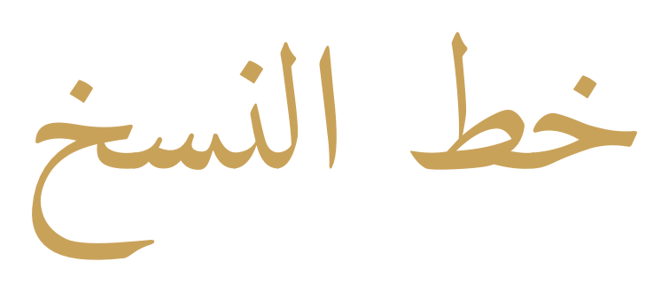
The words "خط النسخ" drawn by the platform in an open Naskh font.

Naskh is the copyists' hand, used for books and Qurans because it stays legible at a small size. Its proportions were later fixed into a strict system, and it became the base of most Arabic printing.

Round, even letters running along a steady line, with short clear uprights and comfortable spacing.
Printed Qurans, books, newspapers, and most of the Arabic text you read on a screen.

Diwani

Diwani was developed in the Ottoman chancery and used for the sultans' decrees. Its tight interlocking construction made a document hard to forge or to alter after it was written.

Sloping letters that curl into one another, with the words pressed together on a rising line.
Official documents in the past, and today invitations, certificates, and decorative titles.

Kufic

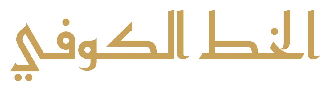
The words "الخط الكوفي" drawn by the platform in an open Kufic font.

Kufic is the oldest Arabic hand, named after the city of Kufa. The earliest Quran copies were written in it, and it stayed the formal script for centuries before the rounded hands took over.

Straight lines and right angles, letters built like architecture rather than written like handwriting.
Building inscriptions, tilework, and old coins, and modern logos that want a geometric look.

Ruq'ah

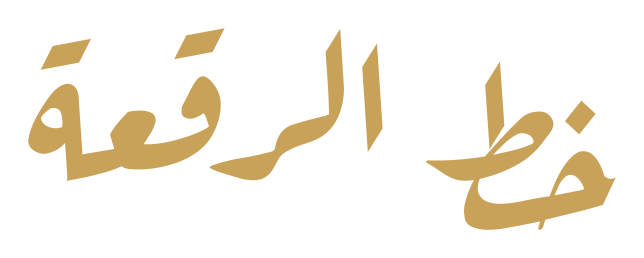
The words "خط الرقعة" drawn by the platform in an open Ruq'ah font.

Ruq'ah is the everyday hand of the Arab world, made for speed. It was simplified and taught as the standard handwriting in Ottoman schools, and it is still what most people write by hand.

Short straight strokes, small closed loops, and letters sitting close together with little decoration.
Handwriting and notes, newspaper headlines, and shop signs.

Farsi, also called Nastaliq

The Farsi hand, also called Nastaliq, grew in Persia out of two earlier scripts. Its calligraphers built it around a hanging line rather than a flat one, and it became the script of Persian poetry.

Words that slope downwards from right to left, with wide flat curves and thin joins.
Persian and Urdu poetry and books, and Arabic titles that want a graceful slope.

The platform draws these samples itself with open computer fonts, so each one approximates its style rather than reproducing a calligrapher's hand.

Try a style on your own words.

Open the editor, write your phrase, and see how it sits in each font you have.